Tuesday, September 27, 2011

Spotlight: Christina Holmes


The Gaze
watercolor, 31" x 24"
Christina Holmes

When Christina Holmes left her native England and relocated to California, she rekindled her lifelong passion for horses as a way to take a break from the fast-paced life of Silicon Valley. She also redirected her illustration talents toward fine art painting in watercolor, focussing on the cowboy culture of the West.

Christina attends the Cowgirl Up gathering in Arizona every year and sold the original of this painting to Toni Tennille (of The Captain and Tennille) on opening night a couple of years ago. Christina also won First Place at the Cow Palace Grand National Art and Wine show a few years ago. She is currently artist-in-residence at Allegro Fine Art in Portola Valley, CA.

Please pop over to Christina's blog to see more of her work.

Friday, September 23, 2011

Spooky doings...


Señor Zapallo has his sights set on Halloween

This pumpkin reminds me of one of my favorite holiday decorations from my childhood. My mom got a ceramic pumpkin when I was about five or six and it was an autumn fixture for years. I lost sight of it about 10 years ago when it went to one of my siblings. [cue in the whiny voice of a 6-year-old here: "But Mommmmmm, I want that!"] So I'm starting my own tradition this year and hope to include Señor Zapallo in my challenge painting.

What challenge painting, you ask? Oh yeah, the details:


Pablo and I have decided on a Halloween challenge this year. We've sent invitations out to several other artists and hope to have a sweet little scary show for you!! And I've been gathering goodies together and now have a fun stash of vintage Halloween items to play with, thanks to eBay. Stick around and see what happens!!

Tuesday, September 13, 2011

Spotlight: Frank Eber


San Pedro Police
watercolor, 10" x 14"
Frank Eber

With a background in illustration, Frank Eber has worked in a variety of media but now concentrates on watercolor. From urban to pastoral scenes, San Pedro to Provence, he conveys the moods of the places he paints using beautiful tonal washes and lively brushwork. His entry into the Transparent Watercolor Society of America show this year won the Anne and Samuel Seeman Memorial Award, and he also won Second Place at Paint San Clemente in June. He is a Signature Member of the National Watercolor Society and teaches watercolor workshops in the greater Los Angeles area.

Frank's blog is informative and well-written and his website gives an excellent overview of the range of his work. Please stop in and check them out.

NWS signature!!!

I got word on Sunday morning that I'd been awarded signature status in the National Watercolor Society!! This is a biggie for me -- it's one of the top societies in the U.S. -- and a longtime dream. In addition to the painting I submitted to the show (starring Nosey Mouse), I had to send three more paintings for review -- two featured my little vintage salt shakers and the third featured one of my tin toys. If you're interested, you can see the three paintings here and here and here.

Now it's back to the studio for the next deadline!!

Wednesday, September 7, 2011

Finding a better way...


Removing finished painting from the stretcher board

I don't have any affiliation with the folks who make this product, but I've found it so useful that I wanted to share my experience with it.

When I got back into watercolor, I painted on watercolor blocks at first. I eventually started using 140 lb. paper, stretching it by stapling it to hardwood-faced plywood that I bought at the lumberyard, cut to size, and finished with polyurethane to prevent the wood from staining the paper. Those boards provided a solid working surface, if a bit heavy. However, removing the staples at the end was a considerable effort, not to mention high risk -- more than once, the little screwdriver I used to pry up the staples slipped and skidded toward my finished painting. And there was the sickening experience of actually having the screwdriver skid *across* one of my paintings, gouging up bits of the image. But the advantages to using stretched paper were enough that I continued using the boards.


This past winter, I bought an Incredible Art Board to take to a workshop and, as a result, will be switching to them for all of my painting. The boards aren't cheap, but they're worth every penny in my opinion. They're lightweight and sturdy and hold the staples firmly in place. More important -- it's SO easy to remove the finished painting. What you see above is an inexpensive plastic palette knife that I use to remove the paper from the board. By simply sliding the knife under the edge of the paper and lifting it up, I am able to free the painting with almost no effort and no worries that I'm going to damage it. The staples lift out with the paper and are easy to remove.

The boards are available in both a full-sheet size and a half-sheet size (both are slightly oversized), but can be cut down with a utility knife -- if you work on quarter sheets for plein air painting, for example. Even if you don't stretch your paper, the boards make a great, lightweight support.

Tuesday, September 6, 2011

Spotlight: Kay Smith


Carnation Carnival
watercolor, 10" x 15"
Kay Smith

Kay Smith is the first artist in a new series I'm starting here on my blog. Spotlight will be an abbreviated form of my watercolor showcase blog -- I'll show you one painting and give you a brief introduction along with a link to the artist's blog and/or website. I'm planning to post at least every other week.

Kay Smith is an incredibly prolific painter, and her work has a freshness that is delightful and inspiring. Trained as a nurse, she has been painting on a daily basis for much of her life. She took her first watercolor workshop in 1993 and opened Brushworks Studio two years later. She has been very successful both as a painter and as a teacher.

Pop over to her blog for a peek into her painting process and stop by her website for a look at the galleries of her works.

Monday, September 5, 2011

TOYS...


Fe Fi Faux Fowl
acrylic on canvas, 30" x 30"
Chris Beck

I got word over the weekend that this fun fellow will be flying east in a few weeks. He's been accepted for the show TOYS: Re-Invent, Re-Imagine, Re-Discover at the Annmarie Sculpture Garden & Arts Center in Solomons, MD (about 60 miles southeast of Washington, DC on Chesapeake Bay). The show runs from October 14, 2011 to January 8, 2012 and includes 62 works by 32 artists.

This painting was quite a departure for me -- both size and medium. I made a brief foray into the world of acrylic a few years ago but scurried back to watercolor with no regrets. I do like the oversize presentation here and the fact that it doesn't need to be framed under glass, but I prefer the process of painting in watercolor to that of acrylic.

Thursday, September 1, 2011

The backstory...


Background trial run

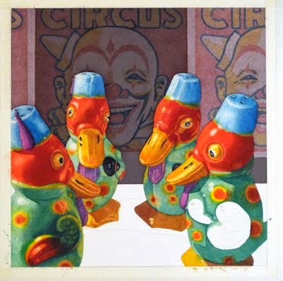
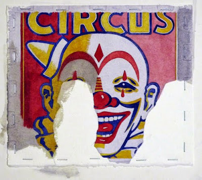
I don't usually work from multiple resources for my still-lifes, preferring to set up a scene, photo it and then crop the best image in Photoshop to serve as my working image. In the case of my most recent painting, Waiting in the Wings, I wanted to set a scene that combined separate elements into a cohesive whole. I started by painting a sample of the background image -- an exercise that chewed up a full day's work time but proved invaluable in deciding how to proceed. It was obvious that sticking to a faithful reproduction of the resource image would not work -- too much distraction from the main characters, the fez-wearing ducks. (To test my composition, I made full-size prints of the ducks, cut them out and pasted them in front of my sample clown.) Plus, the intense colors bled too easily if I tried to run a wash over them. I know I could have chosen to paint the clowns in fluid acrylics, but I enjoy the challenge of creating a painting using only transparent watercolors.

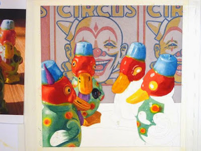
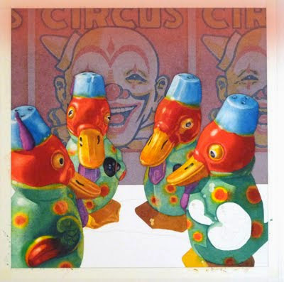
I decided to tone down the background with a warm neutral wash and use muted versions of the original colors. I chose staining colors (quinacridone gold, brown madder, and indigo) and used them quite diluted for the clown's features in case I would need to do further washes on the background. This proved to be a great decision, as I ended up doing at least 6 or 8 washes over the background.

First stage -- light, but muted color background

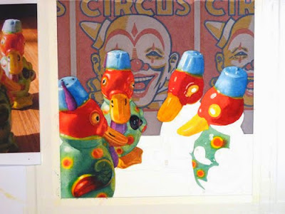
Early on, it became clear that the background was too light and created a visually confusing situation, so I used Photoshop to test a darker background.

Photoshop trial -- darker background


Based on that, I ran a couple of mid-gray washes over the clowns. It seemed too blue, so I later ran some quinacridone sienna washes across the area to restore the neutral tone.

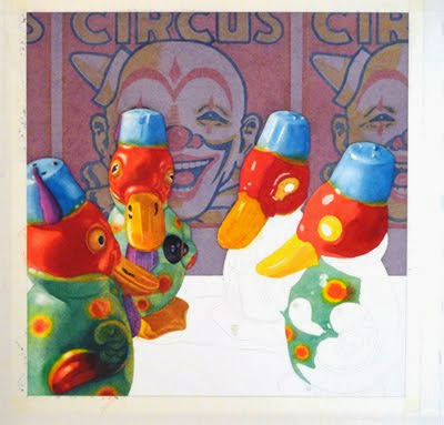
Initial dark washes over the background

As I completed more of the foreground, I became less and less satisfied with the background. It was still too light and the muted tone detracted from the light-hearted mood I wanted. I tried a number of Photoshop tricks in my search for a fix. First, I airbrushed orange across the top of the image -- interesting but weak.
 
Photoshop trial -- airbrush color


Then I tweaked the center by selecting the area and running a "darker" variation on it. That really popped the ducks into the spotlight, but it was dull and uninspiring.

Photoshop trial -- dark center panel

Finally, I tried changing the color of the panels and that looked like a good solution. Nevertheless, I waited until I'd completed the foreground completely before adjusting the color on the background panels.

Photoshop trial -- colorful panels

A series of washes across the panels livened things up and brought the background into harmony with the rest of the painting.


Finished painting -- Waiting in the Wings