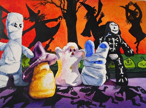
Tuesday, December 27, 2011

Hip Hop Bebop...


Hip Hop Bebop
watercolor, 12" x 12"
Chris Beck

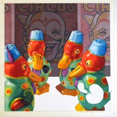
I've been wanting to use these crazy salt shakers since I bought them a couple of years ago, but just didn't have a well-formed idea of what to do with them. A few weeks ago, I did some serious brainstorming and discovered I had the perfect set piece in Frogs, which has been tucked away on my bookshelf for years. Take a minute to check out the central illustration on the book jacket -- I couldn't have special ordered a more fitting scene!!

As we come to the end of the year, I'm going through the flat file drawers and pulling out a few paintings that I set aside because I ran into problems and needed a break from them. I have a bunch of new things on the to-do list as well and I'm looking forward to a creative and fun new year.

Happy New Year to all of you -- I look forward to sharing more art and artists with you in 2012!!

Wednesday, December 14, 2011

Spotlight: Ramesh Jhawar


Poster Wall
watercolor & collage, 14" x 21"
Ramesh Jhawar

Ramesh Jhawar's interest in color and the play of light and shadow is immediately evident in the works he shares on his blog. From the brilliant colors of an urban street scene to the muted tones of a rural landscape, he skillfully captures the essence of his subject. Ramesh's compositions are strong and he incorporates the details of a subject without losing the freshness that is the hallmark of the watercolor medium.

Although he started out getting a degree in commerce and working in his family business, he was inspired to become a professional painter after taking up oil painting. He has also worked in other media in the past, but now concentrates on watercolor, and he is garnering increasing attention on the international level with inclusion in the most recent issue of the French art magazine, Practique Des Arts.

Please go to Ramesh's blog to see a wonderful collection of his paintings and links to gallery displays of his work.

Wednesday, December 7, 2011

Yes, Virginia, these are REAL postage stamps!!


Custom postage stamps make a great gift -- fun *and* useful!! I've just posted six new stamps to my Zazzle store!! -- all images are from my original watercolors or acrylic paintings.

If you order today, you can take advantage of Zazzle's 15% off sale by entering code DECDELIGHT11 in the box in your shopping cart. Stamps ordered today will arrive by Christmas!


Wednesday, November 30, 2011

Spotlight: Stan Kurth


Lunatic Fringe
gesso & acrylic on Yupo, 25" x 19"
Stan Kurth


A self-described "evolving painter," Stan Kurth approaches figurative work with archetypal rather than narrative imagery. Working primarily in acrylic and gesso on Yupo, he uses a subtle palette to create rich, multi-layered pieces that hint at other levels of reality, partially hidden from our understanding.

Stan's work has been widely exhibited and collected and he has an impressive string of awards to his name. He recently became a Signature Member of the National Watercolor Society and is featured as one of the ten "Ones to Watch" in the December 2011 issue of Watercolor Artist magazine.


Please hop over to Stan's website and his blog to read more about him and see more of his work.

Sunday, November 27, 2011

New postage stamps for sale...


Watch the Birdie – first-class postage


Waiting in the Wings – first-class postage

How cool is it to use your favorite crazy critter to mail a letter?? I've just posted two new postage stamps to my Zazzle shop, ChrisBeckStudio. Hope you'll stop in to check them out!! To receive special offers from Zazzle, scroll down to the bottom of my shop page and enter your email address in the box provided. If you're like me, you're looking for ways to stretch your dollar and Zazzle periodically has excellent special deals that bring the price down to nearly the face value of the stamps.

Thursday, November 17, 2011

Demo painting: Dippy Duck #3...


 Dippy Duck #3
watercolor, 8" x 8"
Chris Beck

This demo piece was lurking unfinished in the flat files so I decided to play with the background. I've painted this image twice before, initially with a plain cobalt violet background and then with a deep purple/magenta background of feather shapes. I had found a roller designed for painting walls that has stars scattered over the roller and thought it might work well.

As I usually do before working on the actual painting, I tested my idea on scrap paper. I put the star roller on its handle, poured some masking fluid in a tray and rolled the stars through it, making sure they were well-coated. Then I rolled it carefully across the paper so the stars wouldn't get too distorted. After the masking dried, I brushed a simple wash across it and when that dried, removed the masking with a rubber cement pickup.


Satisfied with my experiment, I cut a frisket film for the duck and rolled a star pattern across the background. After removing the frisket, I painted Winsor violet on the background around the duck, let it dry, and then removed the masking. I painted a deep rose across the entire background and followed that with several more washes to get the color depth I wanted. Unfortunately, the end result was a bit intrusive and the color was dull, so I decided to enhance it a bit with spattered gouache.


Because I would be spattering paint with a toothbrush, I didn't have to make a water-tight seal on the duck image. I cut a piece of frisket film roughly the size of the duck and laid it in place, smoothing it out before trimming it.


With a new X-acto blade in my knife, I gently cut along the outline of the duck and removed the excess film. I pressed it down firmly with my fingers, but did not burnish it down.


Using an enamel tray, I put out small dabs of gouache of a deep magenta, deep ultramarine, and permanent white. I mixed up a medium magenta and a medium blue-purple and spattered them with a flat bristle toothbrush. (Be sure to protect your work surface with newspapers!!) The size of the spatters are related to the amount of water in the paint puddle, so it takes a bit of experimenting to get the size droplets you want. Generally, the more water, the larger the droplets.


I ultimately used five or six different shades of magenta and purple, spattering until I was satisfied with the appearance of the background. (Note that, unlike watercolor which dries lighter than it appears when wet, gouache dries slightly darker.) Then I removed the frisket, pulled the masking tape off the edge of my painting, and signed it. You can see that there was a significant amount of leakage under the tape. This is not a serious problem, since I always mat my paintings, but I prefer a cleaner edge on my non-demo work. I normally use a better tape for protecting the border -- Nichiban tape -- which I discussed in this blog post a while back.


Here, once again, is the finished painting!


Wednesday, November 16, 2011

Spotlight: Carrie Waller


Preservation
watercolor, 14.5" x 20"
Carrie Waller

Ten years ago as a young Air Force bride, Carrie Waller picked up a "how-to" book on watercolor and taught herself to paint. She soon began teaching classes, but it wasn't until two years ago that she got serious about her own work. Shortly after the arrival of her second son, she committed herself to starting a blog and producing a painting a week -- a challenge that she has successfully met for the past two years. With her husband recently deployed to Afghanistan for six months, she is continuing her blog activities and is also exhibiting and selling her work, in addition to her responsibilities as a full-time mom.

Carrie currently has three pieces in the Randy Higbee 6" Squared show in Los Angeles, she just won first place at the Louisiana Watercolor Society's Juried Member Show, and her entry into the LWS's 41st Annual International Exhibit this past spring was featured on the show invitation. In addition, she has had a wonderful year of exhibit successes, winning awards in many of the shows she entered.

Please hop over to Carrie's blog and to her website to read more about her and see more of her work.

Sunday, November 13, 2011

Fun with TOYS...


I was delighted to discover this weekend that my painting is featured on the postcard for the TOYS show at the Annmarie Sculpture Garden & Arts Center in Dowell (Solomons), Maryland.

Equally delightful is this excerpt from the juror's statement: This exhibit cradles an adult's mastery of craftsmanship with a child's sensibility of play. [These artists] keep one foot in the studio, and the other in the sandbox. Pablo Picasso said, "Every child is an artist. The problem is how to remain an artist once we grow up." These artists have uniquely answered his query. -- Andrew Wodzianski, Professor of Art, College of Southern Maryland

The show consists of 60 pieces by 33 artists, with a mix of two- and three-dimensional works. It will run until January 8, 2012. See their website for hours and directions to the center.

Sunday, November 6, 2011

Steampunk pirate...


Señor Terremoto sporting his night-time eyepatch

Well, maybe it's a stretch, but Señor Terremoto and I are trying to put the best spin on this we can!!

I'm probably going to be offline for a bit -- my husband had surgery to repair a detached retina about a week ago and he must remain in a face-down position much of the time for approximately two weeks. He is allowed to be up to eat and shower, but that's about it. We rented a chair that resembles a massage chair -- with a special U-shaped face support -- and he sleeps on a special foam pad setup that we bought just for the occasion!! He has a two-way mirror that's supposed to let him watch TV or movies, but it's not an ideal way to view the world.

And now the moral of this tale: if you have any odd visual symptoms -- new floaters, hazy vision, bursts of light -- speak up!! And get to an opthalmologist as soon as possible!! Treated early, a detached retina is likely to be much less disruptive to your life.

Sunday, October 30, 2011

Halloween Challenge...

The Usual Suspects
watercolor, 8" x 8"
Chris Beck


Trick or Peep
watercolor, 8" x 10"
Pablo Villicana Lara

Expanding our challenge paintings this year, Pablo and I invited 11 other artists to join us for a Halloween celebration. The results are shown in the slide show below and links for all the artists follow. Hope you enjoy the show!!


Visit our participating artists' blogs to see full-size versions of their paintings: Janet Belich, Debbie Cannatella, R. Garriott, Jeanette Jobson, Ron Morrison, Diahn Ott, Suzy Pal Powell, Terry Rafferty, Kay Smith, Deb Ward, and Brenda York.

Tuesday, October 11, 2011

Spotlight: Sandeep Khedkar


Monsoon Fields
watercolor, 13" x 19"
Sandeep Khedkar

By day, Sandeep Khedkar is a business consultant specializing in management training. But he has also been painting since childhood and, some years ago, began a concerted effort to transform his fascination with watercolor and landscapes into a serious body of work. Working most frequently with a palette of beautifully varied and lively greens, his paintings convey the lushness of the Indian landscape. As part of his creative endeavors, he often composes a short poem inspired by the subject of his painting.

Sandeep was recently part of a three-man show at Darpan Art Gallery in Pune, India. He has a blog -- Inspirations from Nature, a gallery on IAG (Indiaart Gallery), and a gallery/shop on the Fine Art America site. Please stop in to visit all three sites -- you'll find a large collection of his paintings in his two galleries and recent news items and new paintings on his blog.

Tuesday, September 27, 2011

Spotlight: Christina Holmes


The Gaze
watercolor, 31" x 24"
Christina Holmes

When Christina Holmes left her native England and relocated to California, she rekindled her lifelong passion for horses as a way to take a break from the fast-paced life of Silicon Valley. She also redirected her illustration talents toward fine art painting in watercolor, focussing on the cowboy culture of the West.

Christina attends the Cowgirl Up gathering in Arizona every year and sold the original of this painting to Toni Tennille (of The Captain and Tennille) on opening night a couple of years ago. Christina also won First Place at the Cow Palace Grand National Art and Wine show a few years ago. She is currently artist-in-residence at Allegro Fine Art in Portola Valley, CA.

Please pop over to Christina's blog to see more of her work.

Friday, September 23, 2011

Spooky doings...


Señor Zapallo has his sights set on Halloween

This pumpkin reminds me of one of my favorite holiday decorations from my childhood. My mom got a ceramic pumpkin when I was about five or six and it was an autumn fixture for years. I lost sight of it about 10 years ago when it went to one of my siblings. [cue in the whiny voice of a 6-year-old here: "But Mommmmmm, I want that!"] So I'm starting my own tradition this year and hope to include Señor Zapallo in my challenge painting.

What challenge painting, you ask? Oh yeah, the details:


Pablo and I have decided on a Halloween challenge this year. We've sent invitations out to several other artists and hope to have a sweet little scary show for you!! And I've been gathering goodies together and now have a fun stash of vintage Halloween items to play with, thanks to eBay. Stick around and see what happens!!

Tuesday, September 13, 2011

Spotlight: Frank Eber


San Pedro Police
watercolor, 10" x 14"
Frank Eber

With a background in illustration, Frank Eber has worked in a variety of media but now concentrates on watercolor. From urban to pastoral scenes, San Pedro to Provence, he conveys the moods of the places he paints using beautiful tonal washes and lively brushwork. His entry into the Transparent Watercolor Society of America show this year won the Anne and Samuel Seeman Memorial Award, and he also won Second Place at Paint San Clemente in June. He is a Signature Member of the National Watercolor Society and teaches watercolor workshops in the greater Los Angeles area.

Frank's blog is informative and well-written and his website gives an excellent overview of the range of his work. Please stop in and check them out.

NWS signature!!!

I got word on Sunday morning that I'd been awarded signature status in the National Watercolor Society!! This is a biggie for me -- it's one of the top societies in the U.S. -- and a longtime dream. In addition to the painting I submitted to the show (starring Nosey Mouse), I had to send three more paintings for review -- two featured my little vintage salt shakers and the third featured one of my tin toys. If you're interested, you can see the three paintings here and here and here.

Now it's back to the studio for the next deadline!!

Wednesday, September 7, 2011

Finding a better way...


Removing finished painting from the stretcher board

I don't have any affiliation with the folks who make this product, but I've found it so useful that I wanted to share my experience with it.

When I got back into watercolor, I painted on watercolor blocks at first. I eventually started using 140 lb. paper, stretching it by stapling it to hardwood-faced plywood that I bought at the lumberyard, cut to size, and finished with polyurethane to prevent the wood from staining the paper. Those boards provided a solid working surface, if a bit heavy. However, removing the staples at the end was a considerable effort, not to mention high risk -- more than once, the little screwdriver I used to pry up the staples slipped and skidded toward my finished painting. And there was the sickening experience of actually having the screwdriver skid *across* one of my paintings, gouging up bits of the image. But the advantages to using stretched paper were enough that I continued using the boards.


This past winter, I bought an Incredible Art Board to take to a workshop and, as a result, will be switching to them for all of my painting. The boards aren't cheap, but they're worth every penny in my opinion. They're lightweight and sturdy and hold the staples firmly in place. More important -- it's SO easy to remove the finished painting. What you see above is an inexpensive plastic palette knife that I use to remove the paper from the board. By simply sliding the knife under the edge of the paper and lifting it up, I am able to free the painting with almost no effort and no worries that I'm going to damage it. The staples lift out with the paper and are easy to remove.

The boards are available in both a full-sheet size and a half-sheet size (both are slightly oversized), but can be cut down with a utility knife -- if you work on quarter sheets for plein air painting, for example. Even if you don't stretch your paper, the boards make a great, lightweight support.

Tuesday, September 6, 2011

Spotlight: Kay Smith


Carnation Carnival
watercolor, 10" x 15"
Kay Smith

Kay Smith is the first artist in a new series I'm starting here on my blog. Spotlight will be an abbreviated form of my watercolor showcase blog -- I'll show you one painting and give you a brief introduction along with a link to the artist's blog and/or website. I'm planning to post at least every other week.

Kay Smith is an incredibly prolific painter, and her work has a freshness that is delightful and inspiring. Trained as a nurse, she has been painting on a daily basis for much of her life. She took her first watercolor workshop in 1993 and opened Brushworks Studio two years later. She has been very successful both as a painter and as a teacher.

Pop over to her blog for a peek into her painting process and stop by her website for a look at the galleries of her works.

Monday, September 5, 2011

TOYS...


Fe Fi Faux Fowl
acrylic on canvas, 30" x 30"
Chris Beck

I got word over the weekend that this fun fellow will be flying east in a few weeks. He's been accepted for the show TOYS: Re-Invent, Re-Imagine, Re-Discover at the Annmarie Sculpture Garden & Arts Center in Solomons, MD (about 60 miles southeast of Washington, DC on Chesapeake Bay). The show runs from October 14, 2011 to January 8, 2012 and includes 62 works by 32 artists.

This painting was quite a departure for me -- both size and medium. I made a brief foray into the world of acrylic a few years ago but scurried back to watercolor with no regrets. I do like the oversize presentation here and the fact that it doesn't need to be framed under glass, but I prefer the process of painting in watercolor to that of acrylic.

Thursday, September 1, 2011

The backstory...


Background trial run

I don't usually work from multiple resources for my still-lifes, preferring to set up a scene, photo it and then crop the best image in Photoshop to serve as my working image. In the case of my most recent painting, Waiting in the Wings, I wanted to set a scene that combined separate elements into a cohesive whole. I started by painting a sample of the background image -- an exercise that chewed up a full day's work time but proved invaluable in deciding how to proceed. It was obvious that sticking to a faithful reproduction of the resource image would not work -- too much distraction from the main characters, the fez-wearing ducks. (To test my composition, I made full-size prints of the ducks, cut them out and pasted them in front of my sample clown.) Plus, the intense colors bled too easily if I tried to run a wash over them. I know I could have chosen to paint the clowns in fluid acrylics, but I enjoy the challenge of creating a painting using only transparent watercolors.

I decided to tone down the background with a warm neutral wash and use muted versions of the original colors. I chose staining colors (quinacridone gold, brown madder, and indigo) and used them quite diluted for the clown's features in case I would need to do further washes on the background. This proved to be a great decision, as I ended up doing at least 6 or 8 washes over the background.

First stage -- light, but muted color background

Early on, it became clear that the background was too light and created a visually confusing situation, so I used Photoshop to test a darker background.

Photoshop trial -- darker background


Based on that, I ran a couple of mid-gray washes over the clowns. It seemed too blue, so I later ran some quinacridone sienna washes across the area to restore the neutral tone.

Initial dark washes over the background

As I completed more of the foreground, I became less and less satisfied with the background. It was still too light and the muted tone detracted from the light-hearted mood I wanted. I tried a number of Photoshop tricks in my search for a fix. First, I airbrushed orange across the top of the image -- interesting but weak.
 
Photoshop trial -- airbrush color


Then I tweaked the center by selecting the area and running a "darker" variation on it. That really popped the ducks into the spotlight, but it was dull and uninspiring.

Photoshop trial -- dark center panel

Finally, I tried changing the color of the panels and that looked like a good solution. Nevertheless, I waited until I'd completed the foreground completely before adjusting the color on the background panels.

Photoshop trial -- colorful panels

A series of washes across the panels livened things up and brought the background into harmony with the rest of the painting.


Finished painting -- Waiting in the Wings

Wednesday, August 31, 2011

The Fantastic Flying Fezmatics...


 Waiting in the Wings
watercolor, 12" x 12"
Chris Beck

Just finished and popped into a shipping box yesterday. Normally, I spend some time (OK -- a *lot*) looking at my finished paintings, so I feel a bit lost today. Hope these little buffoons find a congenial reception!!

Thursday, August 25, 2011

Spring Peepers - now supersized!!


 Spring Peepers
watercolor, 10" x 13"
Chris Beck

These days, everything gets supersized -- even the Peepers painting!! (OK, so supersized may be a bit of an exaggeration, but hey -- all things are relative!!) I revisited this subject this past week because the original challenge painting was a tad small for exhibition purposes. And actually, this is the second go at this size -- the first one met a sad end when I added a wash without thinking it through beforehand. We never become immune to these little "oops" moments I guess!!

I'm painting away, glad to have broken through the block that has been stifling me for quite a while now. It feels great to be back in the studio.

Monday, August 15, 2011

Dashboard widget for QR codes...

Thanks to Señor Terremoto for exploring this topic and sharing what he found!! Technogeeks can be *so* useful!! {insert smiley-face here!!}

If you have a Mac computer, you can get a widget for your dashboard that lets you set up QR codes without going online. Go to this site and
scroll down to the Mac Dashboard Widgets. Scroll a bit further for the QR code generator widget. It's easy to download and install.

To use it, you type in the text box of the widget and it creates a code. Click on the code image and the program creates a .png file which can be saved (click "Save Page As" in the File menu), then opened in Photoshop and converted to a jpeg. The original image is about 2.75 inches square at 72 dpi. By shrinking it to 1.5 inches and increasing the dpi to 130, I got a more manageable-size image that scanned well.


This lets you set up inventory tags for each painting, or URL codes for websites. Pretty much anything you can type in can be converted to a code box image.

Sunday, August 14, 2011

QR codes -- the next big thing...


QR code for chrisbeckstudio.com

QR (Quick Response) codes were originally developed to track inventory in auto manufacturing, but are rapidly becoming more ubiquitous with the increase in smartphone use. (For a more thorough description, read the Wikipedia entry.) They can encode text, URLs, or other data.

Using a smartphone to scan the code above will take you immediately to my website. (For iPhone users, there is a free app -- "Scan" -- in the app store. Google qr code readers to find other smartphone options.) I can see lots of uses for this -- on a business card, on the back of every painting, on the display tags in sales venues. For your own inventory control, the tags attached to the backs of paintings could be encoded to show date of painting, what materials you used, size, etc.
I just learned about this technology and was going to wait a bit to share this, but I got an email today from an enterprising individual who wants to charge $20 per code to provide you with your custom code. There are so many sites that allow you to make free codes that it would be foolish to pay somebody unless they are providing useful additional services. I have looked at two free sites -- SmartyTags and BeQRious -- but there are many more out there. Google qr codes to check out more options. Of the two listed here, BeQRious allows you to make multiple codes without creating an account, whereas SmartyTags gives you only one free code unless you set up an account.

I'd love to hear from anyone who's had experience with these codes or the sites.

Thursday, August 11, 2011

Creative clutter...


A clean studio is a bad sign when it comes to creativity, at least in my world. Nothing to fear these days!! The piles of resource photos, paint testing sheets, mock-ups, and assorted flotsam that have appeared over the past two weeks are getting more precarious by the minute and I couldn't be happier.

As you can see, I'm working on still-lifes right now. Look for more of my little goofy ducks in new and (even) sillier roles!! Here they are, just hanging around waiting for the next photo shoot. Although I set them down without planning, they look like they're eagerly awaiting the next proof to come off the printer.


Wednesday, August 3, 2011

Nosey takes a trip...


A Shocking Discovery
watercolor, 12" x 12"

I got the news earlier this week that Nosey Mouse will be taking a little trip this fall -- he's going to be visiting Los Angeles for the National Watercolor Society Annual Exhibition. This is a tough show to get into and I'm thrilled to be accepted. I'm hoping to meet some of my online friends at the opening reception in late October.

In a frazzle a couple of months ago, I neglected to mention another thrill -- this painting also qualified as a Finalist in The Artist's Magazine Annual Art Competition for 2011. Award winners will be published in the December issue of the magazine.

Tuesday, July 5, 2011

This week at Brush-Paper-Water...


Featured artists for 2011

It is with mixed emotions that I announce the final post of Brush-Paper-Water. I did not come to this decision lightly, but ultimately the need to focus more time on my own work became the determining factor.

I've enjoyed the chance to share some fantastic artists with you over the past two-and-a-half years but I've only scratched the surface of the world of transparent watercolor. I regret that I was not able to feature all the wonderful artists I've discovered during this journey.

I do plan to maintain my personal blog (this one!) and post a bit more frequently once again. I hope you'll continue to visit.

Please jump over to Brush-Paper-Water for a slide revue of the artists featured in 2011.

Wednesday, June 22, 2011

This week at Brush-Paper-Water...


Time on Earth
watercolor, 25" x 39"
Jonathan Frank

I don't remember exactly when I became aware of Jonathan Frank's work, but I vividly recall the crispness and clarity of the images. Combining exquisitely handled watercolor washes with ink outlines, his paintings are truly "high definition" -- giving the viewer the sensation of having very acute eyesight. It's a pleasure to share his work with you.

Please pop over to Brush-Paper-Water for an introduction to Jonathan's work and a link to his website.