Showing posts with label Daniel Smith watercolor paints. Show all posts

Monday, March 10, 2014

International Watercolour Biennial...


Mr. Burbank's Cactus
transparent watercolor, 20" x 18.5"
Chris Beck

Back in January, I received an invitation from Eau en Couleurs – Belgian Watercolour Centre and the National Watercolor Society here in the U.S. to exhibit a painting this summer in the 2014 International Watercolour Biennial in Estaimbourg, Belgium.  I've just completed a fairly large (for me) painting -- 20" x 18.5" -- based on an enormous old cactus that I saw in the Luther Burbank Gardens in Santa Rosa, California.

I want to give a shout-out to Katherine Taylor and John Cogley of Daniel Smith Inc. I met Katherine at a watercolor sampling event at a local art supply store and, a few months later, met John when I went to his fascinating talk on Primatek pigments at an artists' materials expo here in northern California. John is the owner of Daniel Smith Inc., the force behind the company's expansion into new product lines and the worldwide market, and someone who cares about and supports our artistic endeavors with quality materials. Katherine, the sales manager for the wholesale branch of the company, generously gave me watercolor dot cards and other materials so I could try out some new colors.

Cobalt Violet Dark turned out to be indispensable in this painting, along with Quinacridone Deep Gold. Quinacridone Sienna has been my go-to color for mixing darks since I first discovered it ten or twelve years ago, but the star of this particular show is undoubtedly my old favorite -- Green Gold. Thanks, John and Katherine!!

Monday, February 11, 2013

Pigment Play: Lunar Black


Daniel Smith's Lunar Black & friends

Playing with paint is a great way to get to know the properties of the pigments on your palette. From color mixes to novel textures, the opportunities for discovery are endless. Starting today, I'm occasionally going to share some of my experiments and hope you'll be inspired to try some of these yourself.  For the record, I am not affiliated with any of the watercolor manufacturers and will simply feature whatever grabs my attention.

One of the most unusual watercolor paints on the market is Daniel Smith's Lunar Black.  Consisting of Mars black and black iron oxide, it yields fabulous granulation effects -- either by itself or when mixed with other paints.  In the photo above, you see the Lunar Black at the center of the top sample. At the far left is a mixture of Daniel Smith's Quinacridone Deep Gold and Lunar Black. Far right, Daniel Smith's Transparent Pyrrol Orange mixed with Lunar Black. In my experience, it's best mixed with clear strong colors, but it's just plain fun to play with -- I encourage you to get a tube and experiment. As with any granulating paint, you need to lay down a reasonably wet wash and leave it alone until it's dry. Any rebrushing or attempts to add to the wash will disrupt the granulation.

Lunar Black also has a unique property -- because of the use of iron oxide, the paint responds to manipulation with magnets.  In the bottom sample, you see a square of plain Lunar Black on the left. In the center, I've held a small circular magnet under the paper in various places while the wash was still wet to get a dot pattern.  On the right, I took a somewhat larger magnet and moved it around continuously under the paper to concentrate the pigment. If you look closely, you can see evidence of swirling as the magnet attracts the iron particles in the paint. I'm not sure exactly how I'd use this feature in my paintings, but I think it might have promise for landscapes or abstract work.

Until next time, that's it for Pigment Play!!

Wednesday, January 20, 2010

Testing, 1, 2...


There's no denying it -- my nerdy side pops up in the blink of an eye!! While I was picking up some home repair items at the hardware store, I found something called Frogtape. Both the name and the color (a tasteful froggy green -- as it might be imagined by the makers of children's crayons) caught my eye, and then I discovered that it had been treated with (drumroll here) "Paintblock Technology" which is supposed to absorb the water from latex paints and create a seal to prevent paint from seeping under the edge of the tape. Well, if it works on painted walls, a little voice in my head reasoned, maybe it would work on watercolor paper. Enough said. Into the cart it went.

When I got home, I decided to make a proper test of it by comparing it to all the other tapes I have lurking around the studio. From left to right: frogtape, 3M-256, drafting tape, masking tape, clay board tape, delicate surface painter's tape, multi-purpose painter's tape, and tape for hard-to-stick surfaces. (You can see the tape colors in the little squares I cleaned off after painting over them.) All are 3-M except the frogtape. I stuck them on a scrap of Winsor Newton 140-lb. cold-pressed paper, burnished them down with my finger, ran a wash across them, let it dry very thoroughly, and carefully removed the tape. None seemed to harm the paper except the clay board tape, which roughed up the surface noticeably. Although it's not shown here, I then painted a stripe of bright paint down the middle of each white space and, with the exception of the clay board spot, there were no indications of damage to the surface of the paper. You can see that the painter's tapes and the extra grip stuff were most effective at keeping a clean edge. Ironically, the worst happens to be 3M-256 -- the white tape I use to seal the edges of my paintings before starting to paint!!


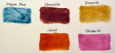
And periodically I succumb to the lure of the more exotic Daniel Smith watercolor paints. This time it was five tubes of Primatek. (I thought I was quite restrained, considering.) I tested each in several ways. What you see here is paint floated onto a pre-wetted rectangle. Although I probably won't make regular use of these, they have some interesting qualities. My favorite is Piemontite -- a very rich earthy color that separates and granulates beautifully. Bronzite has a sparkly appearance (which unfortunately doesn't photo well) as the result of its mineral structure and the sparkle holds up well in mixtures too. Rhodonite and Garnet resemble but are heavier and more opaque than Winsor Newton's Permanent Rose and Brown Madder. Mayan Blue, based on a pigment made of clay mixed with indigo dye, was a disappointment -- gummy and weak and blotchy -- and not likely one I will use in my work.

There's another installment in the masking techniques tutorial on the horizon. See you then.