Tuesday, December 10, 2013

My guest column in The Artist's Magazine...


 Arabesque
watercolor, 9" x 10.5"
Chris Beck

Now that the January/February 2014 issue of The Artist's Magazine has reached subscribers and is in bookstores, I can share the paintings I created for my guest column on masking fluid. 

The article features expanded steps in the creation of both Arabesque and Pelican Dreams as well as several other illustrations to help you make the most of masking fluid, regardless of your choice of subject matter.  If you aren't a subscriber or don't have easy access to a shop that carries the magazine, you can order a paper or digital copy by clicking here or going to the link in the sidebar.

The addition of gouache (pronounced "gwash" -- opaque watercolor -- for more info, check out this page on the Daniel Smith website) to your watercolorist's bag of tricks opens up possibilities for surface embellishment and the use of lighter colors on top of a dark base of transparent watercolor. In Pelican Dreams, I spattered gouache on the background both to tone it down and add visual complexity. Gouache would be off-limits in certain national exhibitions that require transparency, but there is a long history of using gouache, sometimes referred to as bodycolor, to add highlights and depth to a painting.


 Pelican Dreams
watercolor and gouache, 8" x 6"
Chris Beck

Schnozz made his debut here about a month ago, and is just back for an encore visit. He's painted strictly with transparent watercolor.


Schnozz
watercolor, 6" x 6"
Chris Beck

In other news -- I'm sorry to report that I have closed my Zazzle shop.  I discovered quite by accident that they had disabled the design controls I put on my mugs and stamps and allowed buyers to apply the images to different products in the same category. That meant the images were being distorted to fit shapes they were never intended to be displayed on. After going around and around with customer service, I learned there was no option except to re-post every item and reset the controls. And since Zazzle has periodically made other changes that required me to repost some of my products, I have no guarantee that they wouldn't disable my controls again. I cannot constantly monitor something that was supposed to be a fun, no-hassle way to share my work.

Thursday, November 21, 2013

And more sketches...


I've been playing more with Paper 53 on my iPad.  This is just a quick Christmasy scene that I made up -- mostly so I could make snowflake dots!!  I'm learning a lot about getting deep color, using the tools with white or light colors to lift out areas (the glow around the stars and candles, for example), and generally having way too much fun!!


Earlier in the week, I did a favorite little critter from my past. There's a long story behind my interest in frogs and someday when I'm feeling nostalgic, I'll share it here.  I used the frog drawing to try out the felt pen tool and also to work on my smooth washes.  I'm pretty happy with the results!!

I also got another stylus after reading reviews online.  My new stylus is a TruGlide -- with a fun red case and a microfiber tip -- and, happily, it was quite inexpensive. It zooms around on the screen like an Olympic figure skater and is great with the drawing/painting app. Between the Sensu brush and the new stylus, I should be able to create a wide range of effects.

Onward!! Have a great weekend!!

Friday, November 15, 2013

More fun with the iPad...


Almost every year, my fascination with Chinese Lanterns leads me to buy a bunch at the local supermarket floral department with the intention of sketching them or including them in a painting. And every year, I eventually tire of them sometime in December and discard them -- mission unaccomplished.  Not this year!! I am so intrigued with the Paper 53 app on my iPad that I sat down after dinner the other night and came up with this little drawing.  I'm learning as I go.  The short video tutorials included with the app cover a few basic operations and the rest is just a matter of experimenting.  I discovered I really like the pencil tool in the expanded tool kit: although it doesn't give quite the same control as a real pencil, the line appeals to me.

In the last drawing, I used the "loup" feature which allows you to create a magnified area so you can add text or fine details to a drawing. In this one, I discovered that I could reverse the areas that got a bit too dark by selecting the pencil tool and a cream color from the palette and cross-hatching the areas that I wanted to de-emphasize. Overlaying them with lighter color washes mellowed out the line work.  I'm still not happy with my handling of background washes -- they're a bit too splotchy and clumsy looking for my tastes. That's my next challenge.

Saturday, November 9, 2013

My first iPad sketch...


This is a pretty simple little sketch -- my first try at Paper 53.  I just got my first iPad for my birthday, after dithering about getting one for at least a year. I downloaded Paper 53 (free) yesterday, then shelled out a grand total of $9 for the add-on tools and palette and started playing.

I also bought a neat stylus/brush that I'd seen in an art supply catalog recently. I got mine through Amazon and couldn't be more pleased.  It's a Sensu, made by Princeton Brush Co.  The brush isn't essential, but it does give a reasonably good feel of actually painting. The only thing I'd like would be a way to control the size of the stroke, but you just get a single weight line -- good for filling in some color, but not quite as sensitive as a real brush.  This is what the Sensu looks like -- it's like a travel brush, with the brush stored inside the handle.

Although there is a built-in palette with about 15-20 fixed colors, the Color Mixer add-on is a worthwhile addition. It was only a couple of dollars and it works much like the color controls in Photoshop -- slider bars let you control the hue, the saturation, and the value, so you have almost unlimited choices.

All in all, a fun app and the iPad is fantastic. Can't believe it took me so long to take this step!!

Tuesday, November 5, 2013

My "secret project"...


Schnozz
watercolor, 6" x 6"
Chris Beck

I spent most of the month of August on a project that I couldn't discuss until it was finalized. Just got word that it's a go, so....

Sometime last spring, I was invited to be the guest columnist for one of the features in The Artist's Magazine. The Brushing Up column is devoted to technical matters of painting and my article covers one of my favorite art products -- masking fluid.  There are tips on purchasing and handling it, as well as ways of using this versatile product.  Schnozz is one of the paintings I did specifically for the article and there are stepped out examples of how I painted each one.

My article will appear in the January/February 2014 issue of The Artist's Magazine -- due out in early December.  I'll be sure to let you know when it's available.

Thursday, October 31, 2013

Zombie Peeps...


Zombie Peeps
watercolor, 6" x 6"
Chris Beck

Last Easter, I found a box of oddly shrivelled green Peeps on the shelf at one of the local stores and initially rejected them as too creepy for Easter. But when I shifted my point of view, I decided that they might be just the thing for Halloween, so I went back and bought them. (I laugh to recall that I was worried they might not be there when I went back, two days after I first saw them. Guess shrivelled green Peeps don't say Easter to anybody else either!!)

Despite the fact that I had all the "ingredients" for a funky Halloween painting, I had a lot of other things going on and pretty much had abandoned the idea of a Peeps painting this year. But yesterday, I woke up with a bolt of inspiration.  I didn't actually get at the painting until mid-afternoon and I finished at midnight (with time out for dinner) -- quite possibly a record time for me.

So, for your Halloween viewing pleasure, Ladies and Gentlemen, I give you: Zombie Peeps!!

Friday, October 4, 2013

A Pirate's Ransom...


Capt. Hook
watercolor and gold leaf, 4" x 4"
Chris Beck

After seeing some dynamite paintings of autumn leaves with stunning gold leaf backgrounds by my friend Carrie Waller, I decided to try gold leaf to cover a dull and muddy background (don't ask!) on this painting of one of my vintage salt shakers.  I'm very happy with the results and it reminds me of an icon painting now -- no blasphemy intended.

It's been ages since I used gold leaf, and then it was to cover a little wooden box as a gift for a friend.  I'd forgotten a few things in the intervening years. Such as: don't breathe any heavy sighs of exasperation when things aren't going well because you'll only increase your exasperation as bits of gold leaf in your work area scatter like real-world leaves in a windstorm!! And: be sure you don't inadvertently get any sizing (basically diluted glue) on your fingertips or they'll be gold-leafed along with your art and there'll be little holes in the gold leaf on your painting!!

It was a fun experiment and I may try to do more with this technique, but right now, I need to prep a demo I'm doing next Wednesday for one of the local art leagues.  Hmmm -- wonder if they'd like to see a gold leaf background?

Wednesday, August 28, 2013

Flying with the birdies...


I'm working on a special project right now and can't say any more about it, but thought I'd give you a little teaser of one of the paintings that I'm doing for it.  Once again, I'm playing with my collection of salt shakers and hope the results will be pleasing to all concerned.

Wednesday, July 31, 2013

Tech Talk: Replacing your Mission Gold paints

For those who have been following the reports I've made on my tests of Mission Gold watercolors, I have some encouraging news to share.  I have been in email conversations since late June with Dennis Kapp, the Chairman of the Martin F. Weber Company -- the distributor of Mission Gold -- and he has asked me to share this offer.

As previously reported, according to Mr. Kapp, Mission Gold has reformulated 50 of the 90 colors in the original line, replacing pigments of poor lightfastness with more dependable ones.  Mr. Kapp is offering to replace any fugitive color from the old line with its lightfast equivalent from the newly formulated colors.  It doesn't matter if the tubes have been used, or even emptied.  As long as you still have the tubes, you can return them for replacement.

To receive replacements, send your old tubes* of fugitive colors -- along with your snail mail return address -- to:

Dennis Kapp
4444 Lawton Street
Detroit, MI 48208
 
Phone: 313-895-0700

You will receive, by return mail, a new tube of the equivalent color for each tube of the fugitive colors that you send in.

I am sharing this news in the interest of my readers, but I do not have a full list of pigments used in the original line and cannot answer questions about specific colors.  You can check my previous blog post for details on the colors I tested.  I believe some of the same pigments were used in making other colors as well, so you may be able to determine whether you have fugitive colors by checking the labels on your tubes and comparing pigments to those covered in my review.

For those interested in learning more about pigments, I recommend two websites -- Art is Creation and Handprint -- or books by Michael Wilcox and Hilary Page.

* I'm adding my suggestion: Out of consideration for the people who will be opening your returns, remember to pack the tubes in something that will prevent them from being squashed and ruptured in the mail.

Thursday, July 25, 2013

Splash 14...


My copy of Splash 14 arrived a few days ago -- with my fun ducks featured on page 55.  North Light Books does a fantastic job -- the quality of the book is exceptional and I'm thrilled to be in the company of so many wonderful artists, many of whom are my friends. 

Each Splash book is a treasure trove of the best in contemporary watercolor and a wonderful source of inspiration. You can order from the North Light Books shop -- they have both hardback and e-versions available.

Thursday, July 11, 2013

Tech Talk: Lightfastness tests – finale


full view of test card at 6 months
sun-exposed half on left


same card – sun-exposed half moved to right

This is the last post for the lightfastness tests of Mission Gold watercolors that I began in mid-January.  For the last month, I had the sun-exposed card in a window that got much more sun and there was even more fading to the dodgy colors.  As I explained in detail last month, the fading was not unexpected because the pigments used in those colors are rated as poor to fugitive.

Since I posted my previous update, I have had several emails from Dennis Kapp, the chairman of the board of the Martin/F.Weber company, which distributes the Mijello Mission Gold watercolors in the U.S.  Needless to say, he was not happy to see my negative review and said he wished I'd told them about my tests so he could have given me newer, more lightfast colors.  Fortunately, I kept the email correspondence I'd had with his employee, starting with the sample set I received in mid-September, in which I'd pointed out that there were problems with the pigments used in the line.  Although she told me in early January that they were beginning to look at lightfastness matters and would update me, I never heard another word until I received Mr. Kapp's first email in late June.

According to Mr. Kapp, Mijello has reformulated 50 of the 90 colors in the line after receiving feedback at a watercolor society opening last year that there might be a lightfastness problem. (I strongly suspect that the feedback to which he is referring was set in motion by my comments to a watercolorist friend during the National Watercolor Society reception in late September last year.  My friend brought my concerns to the attention of a watercolorist friend of his -- a woman who had been distributing sample sets of Mission Gold at the NWS reception. But perhaps somebody else also expressed alarm about the pigments.)

In his first email, Mr. Kapp listed the pigment changes to the paints that I tested. I've checked them against the lists of reliable pigments, and they are all acceptable.  He also explained that they are creating two versions of some colors -- those labelled as "bright" will be less lightfast.

Mr. Kapp tells me that they have been shipping the newly formulated colors to their dealers for about 60 days now and have instructed their dealers to give replacements for any of the fugitive colors, even if the tubes have been partially used.  

I applaud the company for taking this step, but I have to caution you to be careful. Dick Blick is the only major art supply house that is selling Mission Gold, as far as I can determine.  There is no indication that they are selling a reformulated line and the product numbers are identical to the sample tubes I received last fall.  The local art store that carried Mission Gold removed the product after seeing my lightfastness tests last month. They said nothing about being offered the newly reformulated paint that has supposedly been going out to dealers for the past two months.  If you decide to buy this line of watercolors, ask questions and do some research before purchasing.

Here are some ways to check on pigments: both Michael Wilcox's The Wilcox Guide to the Best Watercolor Paints and Hilary Page's Guide to Watercolor Paints are available through online booksellers, although both are now somewhat out of date -- quite a few new pigments have been added to the world of art since they were published.  I also know of two websites that deal with pigments: Handprint and Art is Creation -- Handprint is chock full of information, but the pigment charts on Art is Creation are much easier to read.

I hope you have found this series of posts instructive and helpful. I strongly feel that artists must demand quality materials -- to accept less is to dishonor our time and talent.

Wednesday, July 3, 2013

Color Blending Workshop


Dramatic Color Blending workshop -- Day Two

Despite abnormally high temperatures in our area this past weekend, sixteen intrepid artists worked to complete a dramatic floral painting using "un-poured" color blending techniques.  By masking and then dabbing color in loosely with large brushes, we achieved the look of a poured painting without the messiness of splashed paint.  Color was subsequently reinforced or modified and details were added in with a variety of brushes.


My finished demo painting


Finished paintings posted for critique

Seeing all the paintings at the end of the weekend was quite a treat!! Although not everyone was able to stay to the finish on Sunday, we had 13 fabulous completed paintings to share!!  (If you'd like to see each of the paintings individually, Guy has posted additional pix on his blog.)

Huge thanks to Guy Magallanes for hosting my workshop.  Guy is the most accommodating and upbeat person -- it's always a pleasure to spend time with him and teach at his studio.

Wednesday, May 22, 2013

Tech Talk: Lightfastness tests – 5 months


full view of my test card –
sun-exposed half on left


center panel compares full-strength color –
sun-exposed paints to left of center


center panel compares tints (diluted washes) –
sun-exposed paints to right of center


Back in January of this year, I began a lightfastness test of these Mission Gold watercolors after receiving some samples of the paints. Because they are new to the market, there were no published lightfastness tests, and many of the pigments used in the manufacturing of these paints were poorly rated in the resources I have.  (See my previous posts here (introduction), here (at 2 weeks) and here (at 6 weeks).)  I put half of the sample sheet in a folder made of acid-free matboard and stashed it in my flat files.  My sun-exposed half of the test sheet started out with several hours of winter sun each day, but at this point, the sun is blocked most of the time by trees.  I've now moved the sample to a spot that gets sun for about 4-5 hours most mornings and will continue the test for about six more weeks.  However, there are such clear changes at this point that I would be remiss in not sharing the results.

I took these photos in full sun yesterday and have done a bit of digital cutting and pasting on the second and third images so you can more easily see the comparison of the full-strength pigments and the tints. (Note that the sun-exposed pigments are on the left side of the full-strength sample and on the right side of the tint sample.)

I should point out that pigments ranked as lightfast on some lists may indeed be lightfast in other media, but unreliable in watercolor paints. As I understand it, this is due to the binding agents used -- oil and acrylic paint bases being more protective of the pigments than the gum arabic used for watercolor.

As noted in earlier posts, the full-strength Permanent Yellow Light (PY17) has darkened with exposure and it has also faded significantly in the diluted wash. Quite a predictable outcome, since the pigment is known to be fugitive.

Yellow Orange (PY65 and PO13) is composed of a very reliable yellow pigment, but also contains the same unreliable orange pigment as Orange (PO13). Both show darkening at full strength and fading as a diluted wash, although it's more pronounced in the Orange sample.

The Permanent Red (PR112) is only slightly changed at either strength, but Permanent Rose (PR122 and PR209) is quite faded both at full strength and as a tint. A bit of a surprise, actually, since Permanent Rose is a mix of two supposedly reliable quinacridone pigments. [added note: There is some disagreement on the lightfastness of PR122, with Michael Wilcox labelling it as unreliable.] The Rose Madder (PR83:1) is actually alizarin crimson, a pigment which has been replaced in most professional-quality product lines by a more lightfast substitute. This paint changed only slightly at full strength, but is noticeably faded as a tint.

Permanent Violet (PV3:1) is anything but. It began showing signs of fading by the second week of sun exposure and is now seriously changed both at full strength and in the tint. This comes as no surprise, because the pigment is a known bad actor.

All three blue paints in my sample -- Ultramarine Deep (PB29 and PV12), Prussian Blue (PB27), and Peacock Blue (PB15:3 and PG7) -- seem quite reliable, despite the inclusion of a mystery violet pigment in the Ultramarine Deep. I can find no information in any of my resources on it, but it doesn't seem to affect the color stability.

Viridian (PG7) is actually phthalo green, which makes it very stable, but also a very strongly staining paint. Sap Green (PG36, PBr25, and PY17) includes the same yellow pigment as Permanent Yellow Light, which means it shares the same problems -- darkening at full strength and very noticeable fading in the tint.

Burnt Sienna (PR101) was a definite suprise -- fading badly across the board. Not a true burnt sienna, it is composed of a red pigment that is supposed to be very lightfast, but this sample didn't live up to the reputation of the pigment. 

VanDyke Brown (PBr9) is made of a pigment that does not appear in any of my resources, but is similar to one that is rated fugitive/unreliable. It faded particularly badly as a tint -- in both samples!! I had to go back to check my photos at 6 weeks to verify that there had been a noticeable difference in the exposed and non-exposed tints at that time. I therefore have to conclude that simply exposing this paint to air will cause it to deteriorate at tint strength.

So I'm sorry to say, but my advice would be to avoid Mission Gold paints as they are currently formulated -- unless you're planning to channel Picasso's Blue Period or keep your work in a drawer.

Friday, May 17, 2013

My demo for CWA...


My demo painting -- next to last step

I had a great time as the guest artist for the California Watercolor Association at their May meeting on the evening of the 15th.  My husband drove over with me (their meeting spot is about 70 miles from my home), served as general roadie, and also took these pictures during the demo.  He managed to capture most of the steps along the way, although he was unable to get a picture of the last step I did during the demo.  But I'll be posting more photos after I finish the piece, so you'll be able to see all the steps after the last image posted here.

I originally had a different image drawn out (in five steps), but realized about a week before the demo that it was much too complex for a 90 minute demo.  At that point, it was scramble time so I decided to give my favorite vintage salt shaker another turn in the spotlight.  In addition to painting on this image, I talked about prepping my images, chosing background resources, and using masking fluid to save highlight areas and frisket film to protect the shaker when stamping or spattering the background.
 

Starting point

I had the body painted in before I arrived.  The main color is new gamboge, mixed with some Daniel Smith quinacridone deep gold and a little Winsor violet (dioxazine) for the shadowy areas on the base of the shaker.


Step one -- painting the head

I'm using French ultramarine blue for the main color on the head and mixing the blue with a bit of Daniel Smith's quinacridone sienna for a deeper tone to model the three-dimensional form.


Step two -- the wing is complete

Next, I painted in the wing, using cobalt green.  Because I wanted to show how the glaze on the wing bled into the body, I lightly painted a clear water wash on the yellow body so the green would drift into the yellow slightly.


Step three -- painting the bill

I'm using scarlet lake for the main color on the bill and a mix of scarlet lake and Payne's gray for the darker red that I pulled along the edge of the bill to give it form.  In this photo, I'm adding an orangy-red -- made by adding a bit of new gamboge to the scarlet lake -- to the center of the bill to give it a subtle highlight.


All the large color areas are complete

At this point, the main areas are colored in and it's time to add the black details.  I mixed up a nice deep black with French ultramarine blue and Daniel Smith quinacridone sienna and am starting to paint in details around the eye in the next photo.


Step four -- painting in the black details


Step five -- bringing the highlights to life

In the last step I have to show you, I have removed the masking fluid and am softening the edges of the highlights to make them look realistic.  This step also shows the preliminary background -- I painted a rosy purple across the background and then stamped it with masking fluid using a stamp I'd cut out of a compressed sponge.  I protected the painted shaker with frisket film (actually a transparent, low-tack contact paper that I bought at either a hardware store or drugstore).  

The last step of the demo was to pull a deeper purple wash across the background to make the stamped images pop.  Unfortunately, my husband didn't capture it with the camera.  When I finish this painting, I'll remove the masking fluid and very likely spatter some gouache on the background to soften the pattern and keep it in a supporting role to the main character.

Hope you enjoyed the demo.  Stay tuned for the final results.

Saturday, April 13, 2013

New Color Blending Workshop...


I'm really excited to be doing another watercolor workshop at my friend Guy Magallanes's studio!!  Guy has created such a congenial space -- it's just a pleasure to be there.  We're expanding this workshop a bit (starting on Friday afternoon and continuing with full days on Saturday and Sunday) to make sure everyone will have time to complete this painting.  I'll also be showing you some simple things you can do to make a rather plain resource photo pop with energy.  I hope you'll join me in June!!

Saturday, March 30, 2013

Fourth Annual Peeps Challenge!!


Little Bo Peeps
watercolor, 6" x 6"
Chris Beck

I hauled out my artistic license for this one: anyone who collects vintage tableware will undoubtedly recognize the girl salt shaker as Little Red Riding Hood, but by cleverly painting the hood pink instead of red, I have magically transformed her into Little Bo Peeps!!  If you look closely, you'll notice that two of the Peeps are also salt shakers -- a lucky find just as I started planning my painting.
 

Equality for All Peeps
watercolor, 6" x 6"
Pablo Villicaña Lara


Happy Hour Peeps
watercolor, 10" x 10"
Kathleen Ballard


A Fistful of Peeps
oil, 11" x 14"
Geraud Staton

I'm pretty sure the original Peeps Challenge was something Pablo dreamed up in a moment of grand silliness, but now it's almost an institution -- four years and, Peeps willing, forty more!! Pablo and I have shared this challenge each year since then, with a changing cast of other participating artists. Joining us this time around are Kathleen Ballard and Geraud Staton.  I love the creative fun that this challenge provides and, judging from their witty results, so do my fellow Peepsters.  I've provided links to posts about the challenge -- hop over to read more.

Friday, March 29, 2013

Catching up & a teaser...


Hip Hop Bebop
watercolor, 12" x 12"
Chris Beck

I've been doing the happy dance here on a regular basis lately.  Hip Hop Bebop was recently selected for the Northwest Watercolor Society's upcoming international exhibition on Mercer Island, WA by juror Mark Mehaffey. The show dates are April 15 to May 31.

Then, yesterday, I heard that Hip Hop Bebop was also chosen for publication in Splash 15: Creative Solutions, part of the ongoing series published by North Light Books.  Publication date is set for Summer 2014.


 Waiting in the Wings
watercolor, 12" x 12"
Chris Beck

And a few weeks ago, I learned that Waiting in the Wings will be included in the Transparent Watercolor Society of America's exhibition (May 4 to August 4) at the Kenosha Public Museum in Kenosha, WI.  Jurors were Robin Berry and Paul Jackson.
  
And please keep an eye out for these little guys! >>>

I'm joining with my friends Jelaine Faunce, Pablo Villicaña Lara, Kathleen Ballard, and Geraud Staton in the Fourth Annual Spring Peeps Challenge!!  We plan to post by Sunday morning.


Monday, March 11, 2013

Mugs, mugs, and more mugs!!


There's a sale going on in my Zazzle store this week -- 40% off on all mugs until Thursday night at 11:59 PDT.  This is a great opportunity to buy your favorite mug or give one to a friend!!  Use code LUCKY4CLOVER at checkout to get the discount.

(In addition to the mugs shown above, there are four more -- two feature vintage ceramic critters and two feature coffee beans on a background inspired by African mudcloth designs.)

Tuesday, February 26, 2013

Tech Talk: Pigments - Week 6


Lightfastness Test Strips
(bottom half is the sun-exposed section)

Back in January, I painted these test strips of Mission Gold watercolors because I was concerned about the lightfastness of the pigments used in manufacturing these paints.  As I've reported before, I cut the sheet down the center and put half in a drawer in my flat files and half on an enclosed porch that gets a few hours of strong sun on clear days.  Despite the limited sun exposure during our rainy winter months, there are definite changes to many of these pigments.

The sun-exposed yellow has become darker in the full-strength strip, but other colors have either become slightly dull or are changing color slightly.  At full strength, permanent rose, permanent violet, and burnt sienna are faded and somewhat duller now and prussian blue is slightly faded and also leaning towards green. 

Changes are more noticeable in the tints, which is often the case with impermanent pigments.  While orange and peacock blue had only slight fading, there is noticeable fading to the permanent rose, rose madder, permanent violet, prussian blue, and burnt sienna.  Sap green and Van Dyke brown both showed moderate fading. 

Out of curiosity, I changed the white background of my photo to a 60% grey tone in Photoshop.  The neutral grey really makes the colors pop and makes it easier to see the changes to the sun-exposed pigments.


I'll be leaving the test section in place on the porch for the forseeable future.  Even with many hours of full sunlight, it can take several months to see the full extent of changes to pigments.  I plan to report back here in a month.

Sunday, February 24, 2013

Mugshots and mustard...


I've just released two more images as mugs -- on the left, Debonair Duck and Colonel Mustard on the right. Mr. D. Duck is a vintage salt shaker in real life and Colonel Mustard is a vintage mustard pot, although I don't think he has a clue that he's such a lowly table item -- not with that fierce demeanor!! These two bring the mug count in my Zazzle shop up to an even dozen. Pop over and check them out!!

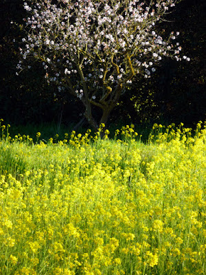
The subject of mustard brings me around to some photos of my neighborhood.  Our area had extensive orchards many years ago and a few remnants still exist.  This nearly defunct orchard is about three blocks from my house -- it's mostly walnut trees (or what's left of them), but there are two or three flowering trees too, probably plum.

February is mustard time here and we have a bumper crop this year, due to generous rainfall in December and January.  A "booster shot" storm early last week set the fields abloom this weekend.


Happy Monday!!  Have a fabulous week!!

Thursday, February 14, 2013

Peeps mugs!!!


Calling all Peeps lovers!! Check out the new mugs in my Zazzle shop!! Be the first on your block to collect them all!!! 

What a great trio this makes -- all the primary colors!!  Three of my Peeps paintings are reproduced on classic white mugs and the images are printed on both sides so your breakfast mates can enjoy them too. Get one (or two or three!!) at my Zazzle store -- ChrisBeckStudio.

These are high quality mugs with bright, clear graphics, as you can see. They can be used in the microwave, but should not be run through the dishwasher.

L to R: Five blue Peeps join a couple of vintage ceramic bluebird salt shakers in "What Did You Expect From Marshmallow Eggs?"  A clever tin toy frog thinks he can hide out in a box of classic yellow Peeps in "Spring Peepers." A solitary pink Peep sits on a nest of foil-wrapped chocolate eggs, dreaming of hatching a flock of chicks in "Hope Springs Eternal."

Tuesday, February 12, 2013

Images from the Shanghai Biennial...


Opening reception begins

I discovered that there were some new pictures of the Shanghai Zhujiajiao International Watercolour Biennial on their website, including some views of the actual gallery displays.  To my delight, I saw my own painting in one of the photos, although you almost need a magnifying glass to see it!! 

They have a short slide show that covers some of the opening ceremony activities in addition to the gallery images. If you'd like to check it out, you can click here.  You can either view the slide show or click on the individual thumbnail images to enlarge them. To begin the slide show, hover your mouse over the large image to bring up the start button. My blue morning glory painting appears on the far back wall in the next to last slide, shown below.